My friend JP shared this presentation via twitter and I am ashamed to say I have participated in the dark side of design. Personally I think of my time at the CBC as a sort of penance – a purgatory if you will.
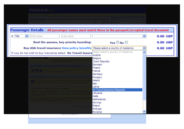
Dark patterns shows the ways companies and UX designers have set out to trick or screw people one way or another. Look at this example from Ryan Air. If you don’t want to buy their stupid travel insurance you have to select “No Travel Insurance Required” but it is buried in a list of countries. If you select your country of residence, you buy insurance. If you do nothing, you buy insurance. Travel insurance is opt-out so you’d have to figure it out. Plus the no insurance option is buried between Latvia and Lithuania, it’s not even in alphabetical order!
 And don’t bother trying to contact them to complain, they have buried their contact information behind a maze of pages. Some analyst is going to burn in Hell for helping them optimize this process. This type of nonsense should be illegal. It is a brilliant presentation which describes how these companies trick people, make it easy to get in but difficult to get out.
It is a scam, a trick. It is the equivalent of someone putting items in your shopping cart while you go to buy milk. I was looking at buying an Android as my next phone but after reading about bloatware I might rethink that. Bloatware are apps that are added to the phone without your consent and then charges you for them.
I also like his suggestion that we “name and shame” these big brands that do these sorts of acts.
